Midjourney Version 5.2: Zoom Out. Enhance.
Midjourney just released the latest iteration of its text-to-image model: Version 5.2. Here's a rundown on everything that's new.
This week was uncharacteristically slow when it comes to major AI releases for the average user. (But see below for the big SDXL 0.9 announcement by Stability AI).
So in lieu of the usual 10X AI round-up, I’d like to dive into the newly released Midjourney Version 5.2.
Still, here are a few links to noteworthy AI news, not to leave you all hanging:
Stability AI launches SDXL 0.9: A Leap Forward in AI Image Generation [StabilityAI]
Vimeo intros a trio of AI-powered editing features [TechCrunch]
ElevenLabs’ New Generative Voice AI and $19m Series A Round [ElevenLabs Blog]
Now let’s dive into the nifty new features in Midjourney 5.2.
Midjourney V5.2. follows just one and a half months after the latest Midjourney V5.1.
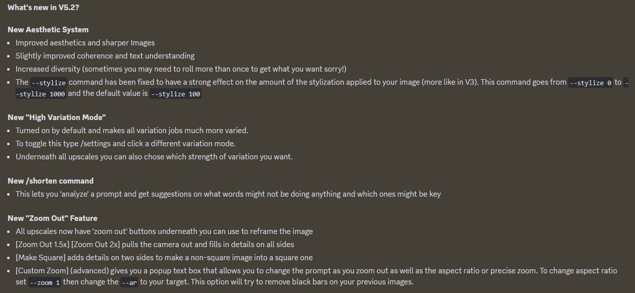
Here are the V5.2 release notes from the Midjourney team:
How do all of these look in practice? There’s only one way to find out!
(The “Zoom Out” outpainting feature is by far the most impactful new tool from Midjourney in a long time. I’ll save it for last.)
1. Improved aesthetics and sharper images?
The jump in image coherence and realism from Midjourney V4 to Midjourney V5 was so profound that it’s honestly quite hard to spot further improvements in incremental releases like Version 5.1.
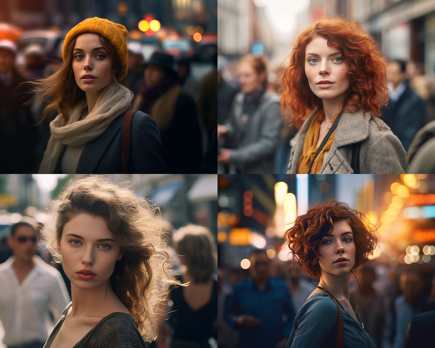
Here’s a Midjourney V 5.1 four-image grid for “professional close-up photo of a woman on a busy street”:
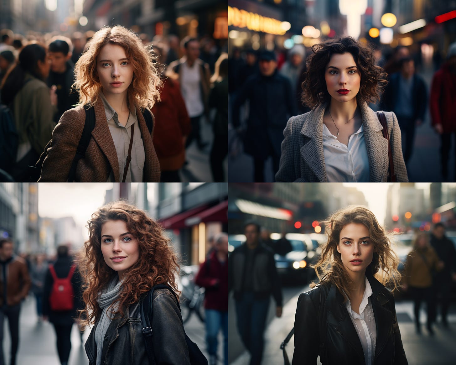
And here is the same prompt in the new Midjourney Version 5.2:
To my untrained eye, there’s virtually no difference in overall quality or sharpness. If anything, I feel V5.1 more faithfully reflects the “close-up” modifier of the prompt.
Perhaps Version 5.2. is especially great for certain types of styles? If you’ve come across prompts where V5.2. truly shines compared to previous versions, let me know!
2. Coherence and text understanding
Once again, this one’s tricky to prove conclusively.
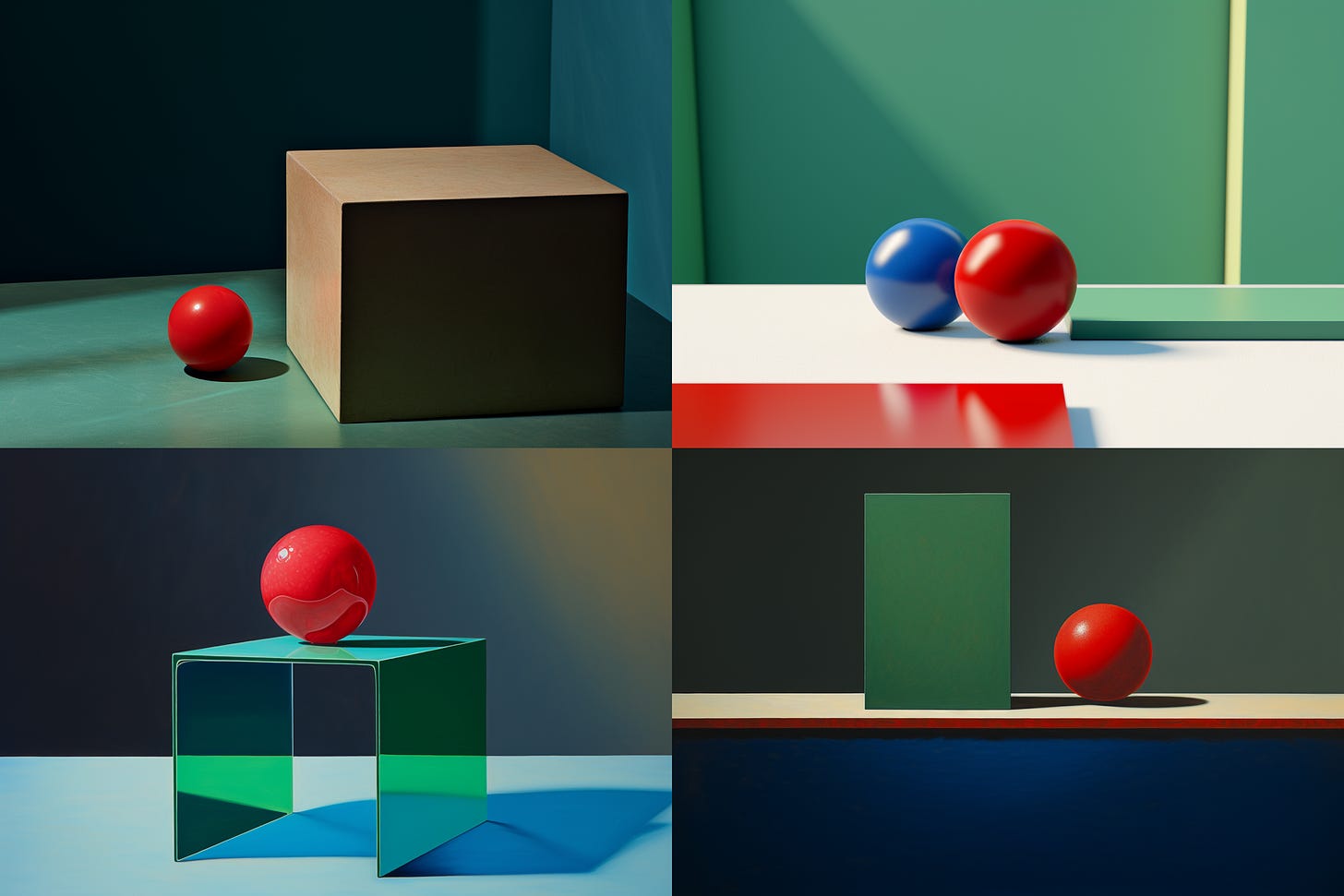
My usual test is to check whether Midjourney gets better at understanding prompts involving multiple subjects with different descriptors.
Something like: “two red balls and one blue cube on a green table”
As this 4-image grid shows, we’re not quite there yet:
Do you have better examples of improved coherence or text understanding in Midjourney V5.2? If so, please feel free to share!
3. Stronger “--stylize”
The “--stylize” parameter in Midjourney controls how wild or “artistic” the bot gets.
The lowest setting (“--stylize 0”) creates an image that stays true to the prompt but might be somewhat bland.
Cranking “--stylize” to the highest setting (1000) adds all sorts of details, colors, and embellishments to your subject but might ignore some of your prompt details.
The “--stylize” parameter in the new V5.2 is supposed to have a more profound effect than in the previous versions.
Let’s look at the same image in Midjourney V5.1 with a --stylize of 0, 300, and 1000. The prompt is “ornate and colorful Mayan mask”:
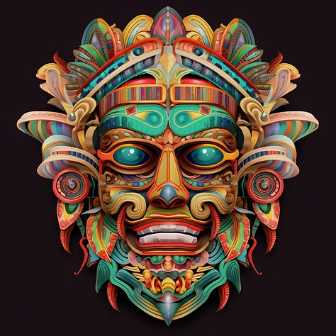
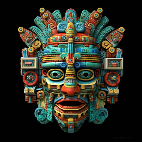
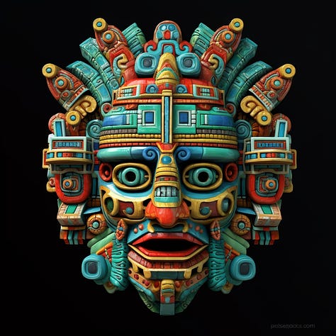
There’s definitely a clear change from 0 to 300, but the jump to 1000 is almost imperceptible (although it is there if you look closely).
Now here’s a fixed Midjourney V5.2 image with stylize set to 0, 300, and 1000:
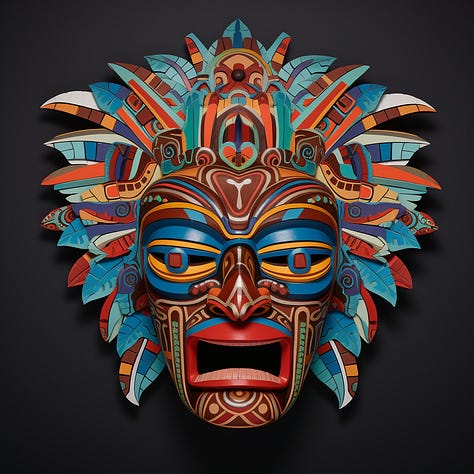
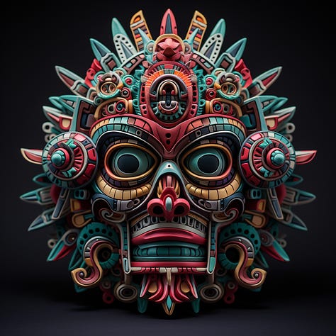
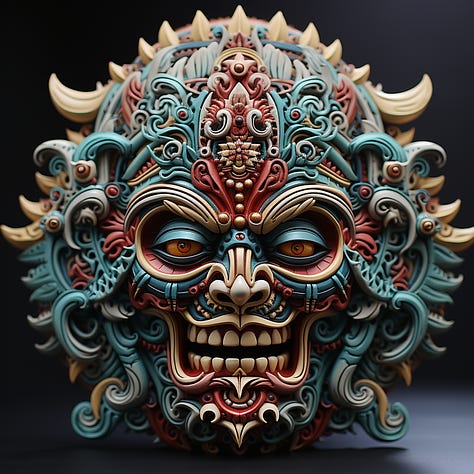
Whoa! The “--stylize” parameter is obviously more powerful in Version 5.2.
(But notice how we move away from the “mask” feel as the details get crazier.)
4. High / low variation
The new Version 5.2 introduced a way to control just how much variance there is in variations of a given image. You can set the default behavior to either “High” or “Low” variation by using the “/settings” command:
Additionally, when creating variations of a single upscaled image, you can pick the level of variance directly with the appropriate button - Vary (Strong) or Vary (Subtle):
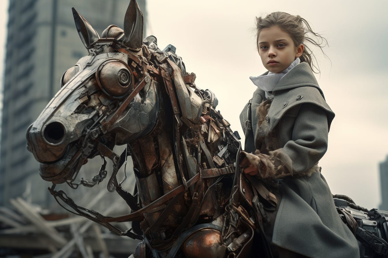
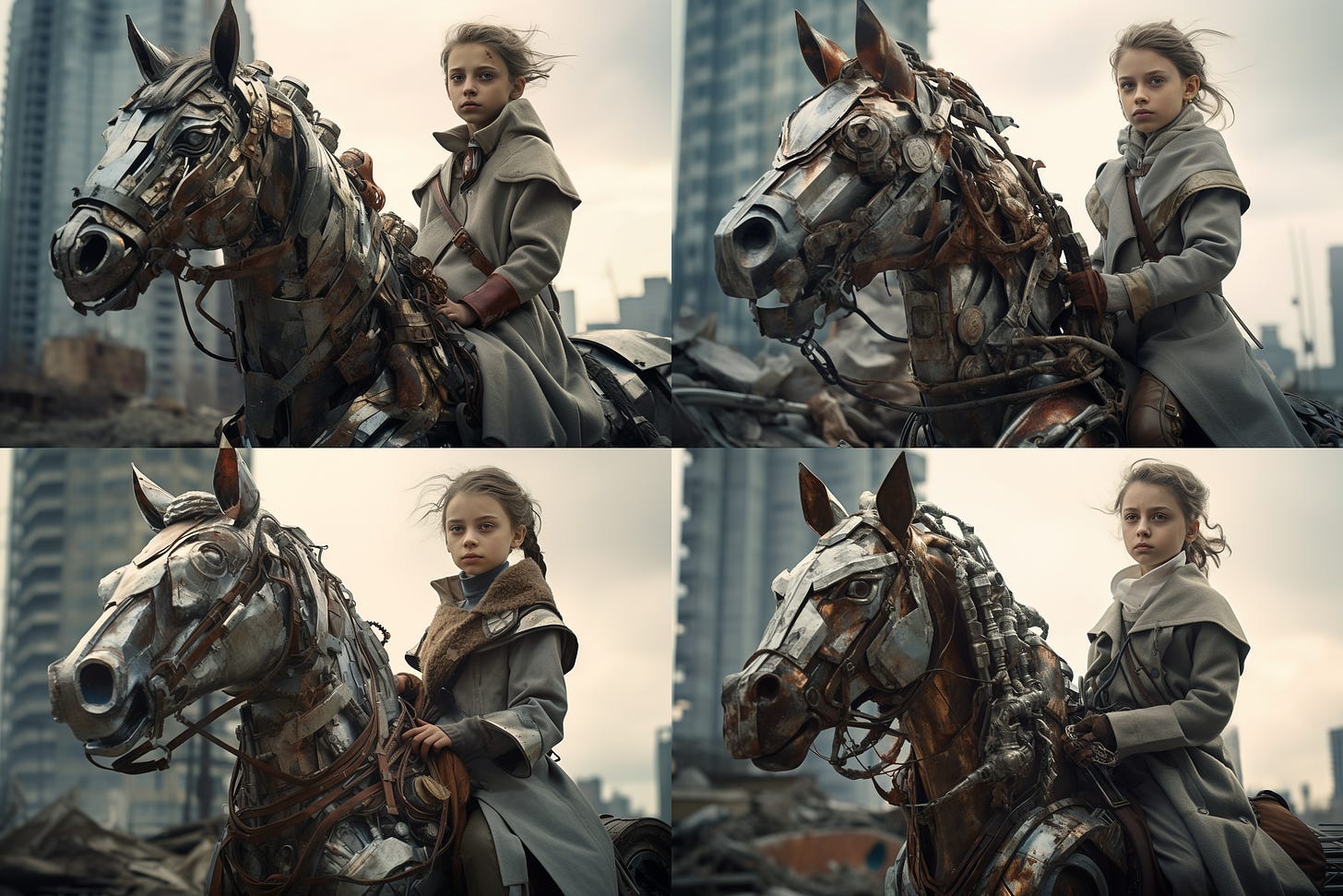
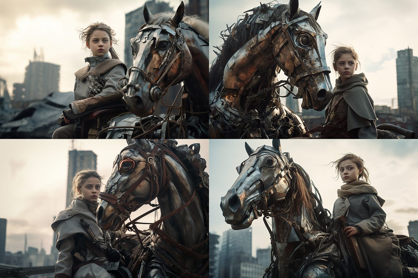
Let’s see what this means in practice by using this base image for the prompt “girl on a metal horse, dystopian city, sovietcore”
First, let’s ask for alternatives with a low variance:
Now let’s look at the high variance images:
It’s immediately clear that the “low” setting sticks faithfully to the scene’s composition, keeping the buildings and all the characters in the same spots.
The “high” variance grid shuffles things around more liberally but still draws inspiration from the look of the horse, the girl’s clothing, and the city background.
There will definitely be situations where either option will come in handy, depending on how closely you want to stick to a given scene.
5. The new /shorten command
I was pretty excited about this one!
In theory, the /shorten command is supposed to analyze the prompt, identify the most impactful words (tokens) in it, and suggest a shorter prompt that outputs the same result while dropping the unnecessary modifiers.
If you recall my post on splatterprompting, I’m a huge proponent of keeping prompts as clean and minimal as possible. The /shorten command was supposed to help people avoid splatterprompts and get better at figuring out what’s important.
In practice, however, I’m not convinced it works well just yet.
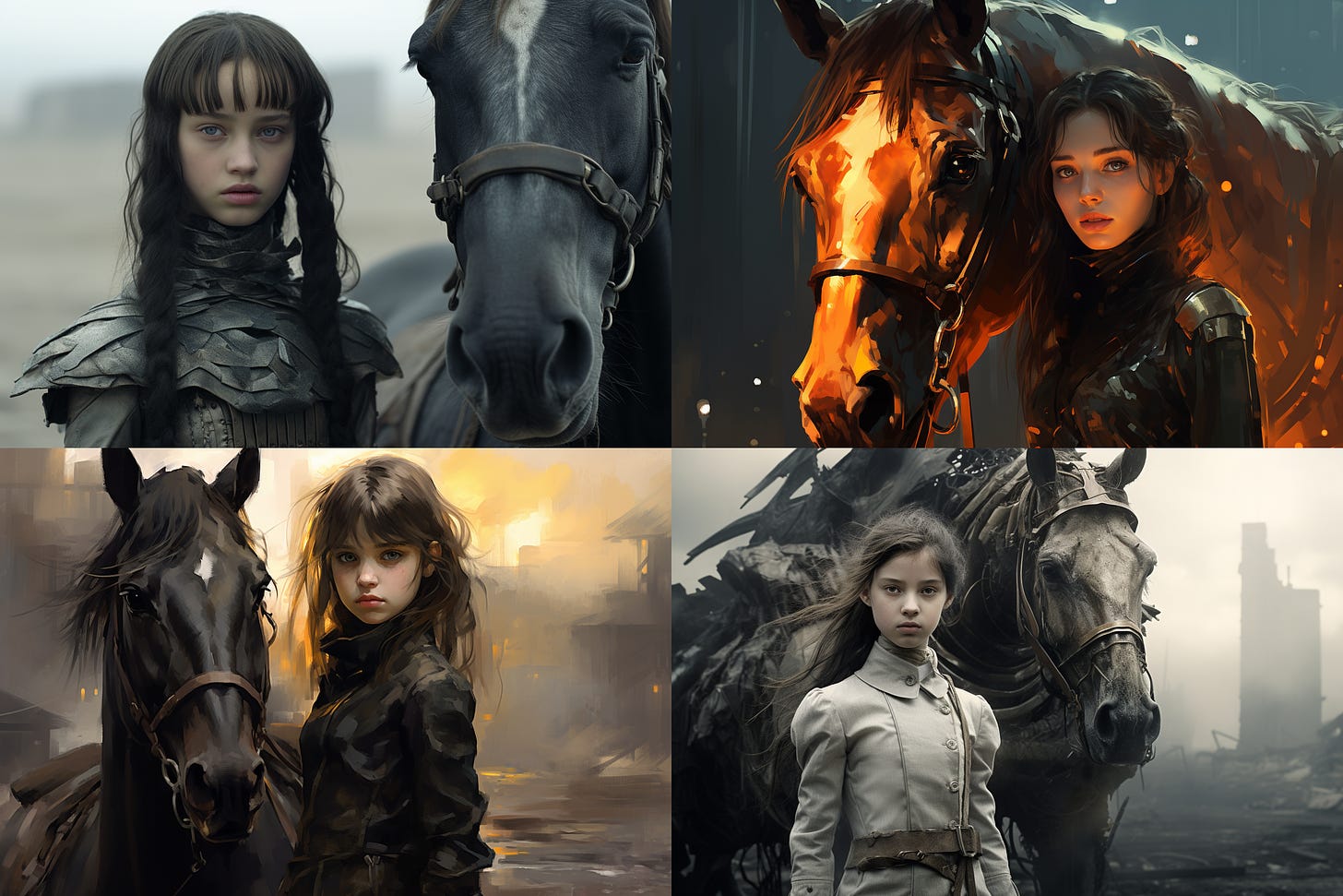
Here are its suggestions for shortening my “girl on a metal horse, dystopian city, sovietcore” prompt:
The “girl on a metal horse” part is integral to my prompt, so we can’t just remove “on” and “metal” and expect a similar image.
And sure enough, the resulting image grid is quite far from our original:
But maybe my prompt was already so concise that the model was unfairly forced to drop impactful modifiers because we asked to shorten it further? (Then again, I’d expect the “dystopian” or “sovietcore” qualifiers to go first in order to at least keep our main subject in place.)
The command does better with longer splatterprompts that use lots of redundant or conflicting descriptors. Here’s how it suggests shortening one of our insane examples from the “splatterprompting” post:
But it’s clear that the resulting images don’t have the same vibe at all:
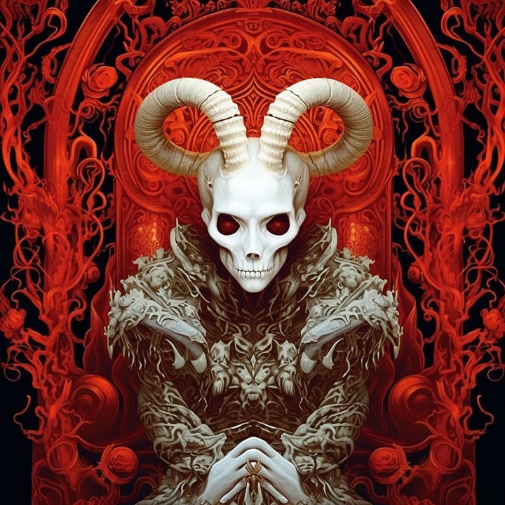
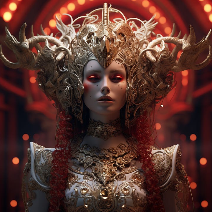
Since the “Rococo fresco” was a key part of the original prompt, we can argue that the shortened image is actually more faithful to its intent.
But as it stands, the /shorten command doesn’t quite succeed in distilling long prompts into equivalent shorter ones that give the same output.
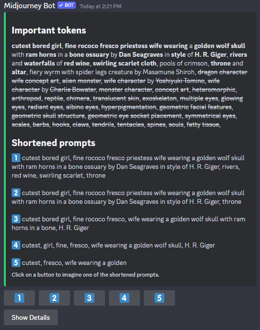
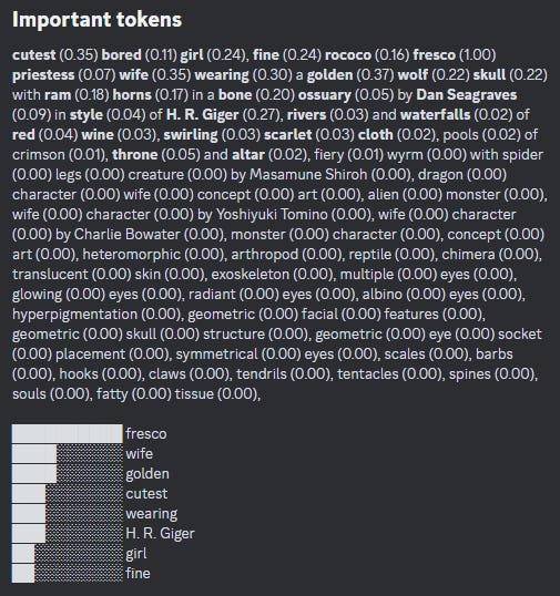
What is perhaps more useful is the “Show Details” button that outputs a graph of tokens and their relative importance:
This could help people identify what matters and what’s noise…if it works.
In short, here’s my recommendation for the /shorten command as it now stands:
If you’re already good at keeping your prompts to a minimum, avoid using it. It’ll be forced to cut away something important by default.
If you’re in the habit of writing or copy-pasting long-winded prompts and need help identifying the essentials, use the /shorten command with “Show Details” to learn more about how the model works.
6. The “Zoom Out” feature is awesome!
This is the moment many have been waiting for: Outpainting finally comes to Mijdourney!
Better late than never, I guess?
The outpainting feature is currently quite limited compared to what you might be used to with DALL-E or Stable Diffusion tools. Instead of letting you select the exact areas to outpaint, Midjourney fills in an equal amount of space on all sides of the image. There are three outpainting options:
1. “Zoom Out” (1.5x or 2x)
There are two predefined “Zoom Out” levels.
As the numbers suggest, “1.5” adds 50% to the image while “2” doubles the original image dimensions.
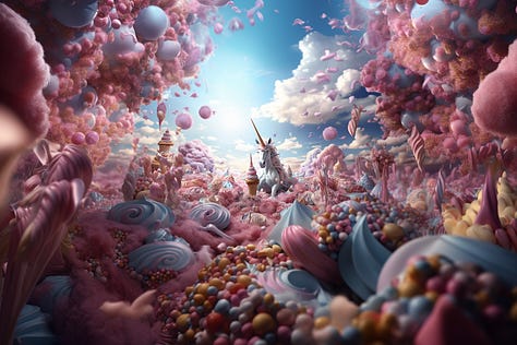
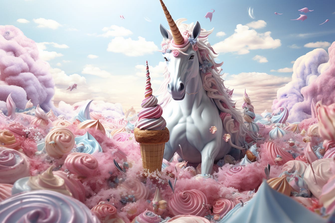
Here’s a “unicorn surrounded by ice cream” that my daughter asked to make:
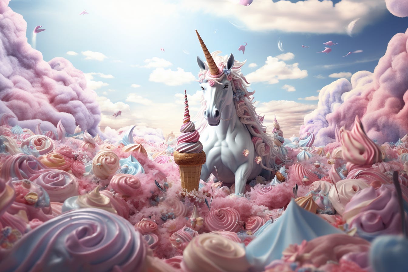
Here is our unicorn zoomed out at 1.5x…
…and at 2x:
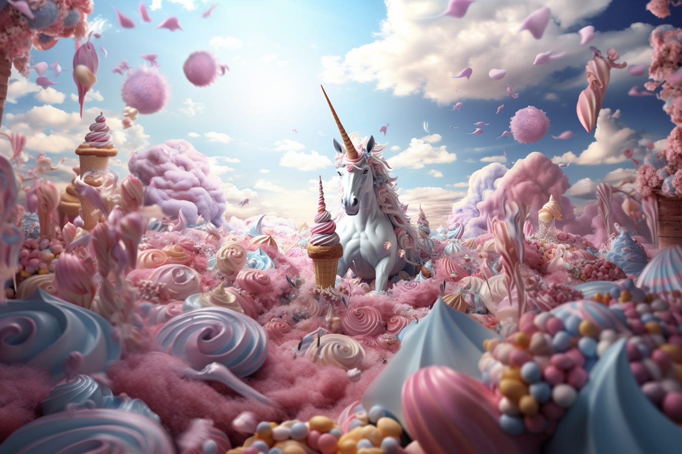
This zooming out process is basically endless. After you pick your preferred zoomed-out image, you can “Zoom Out” further and further. Like so:


2. “Make Square”
This is a more limited version of ClipDrop’s “Uncrop” feature (which lets you adjust an image to any aspect ratio by automatically filling in the missing gaps using outpainting logic).
The “Make Square” command does the same but only for the 1:1 ratio. The zoom level remains unchanged. Here’s what it does to our original, landscape unicorn image:
3. “Custom Zoom”
This somewhat understated button is where the true outpainting magic happens.
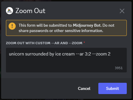
Clicking it opens up a dialogue box like this one:
This box lets you do three different things in any combination:
Change the “zoom” level by any number between 1 and 2 (“-- zoom 1.5” and “--zoom 2” will do exactly the same as the corresponding “Zoom Out” buttons).
Change the aspect ratio to anything (“--ar 1:1” will work exactly like the “Make Square” button)
Change the text prompt itself.
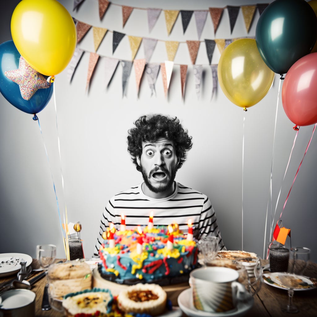
It’s that third option that’s really special: By changing the prompt, you get to not only zoom out from an image but decide what the new sections of the image contain!
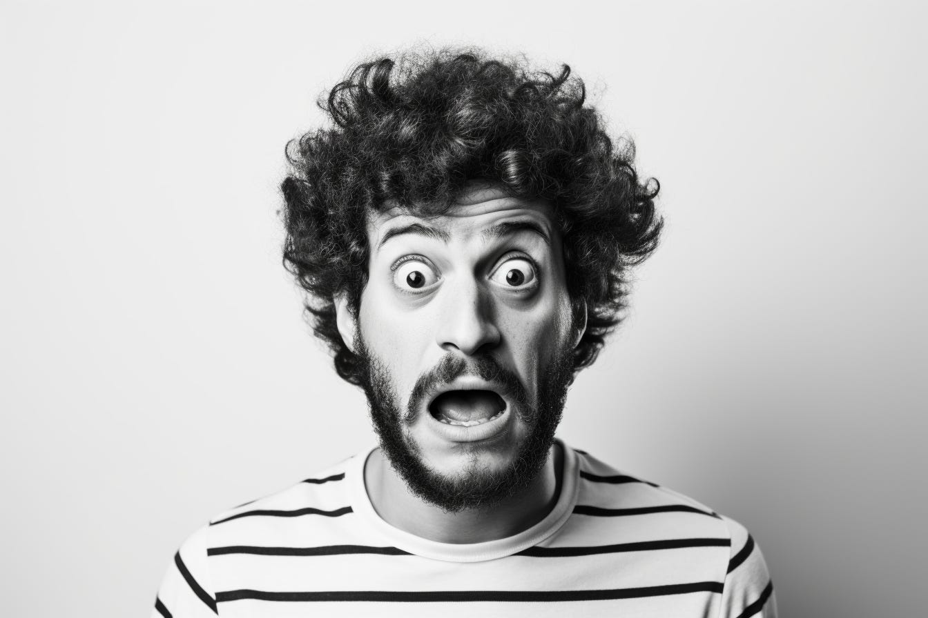
To demonstrate this, I can take this landscape image of a surprised/scared man…
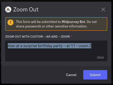
…then ask for a square picture of him at a surprise birthday party, while zooming out by 2x to give Midjourney some new areas to work with:
Here’s what that gets me:
This lets you get endlessly creative by putting your subjects into whatever scenario you can think of. So naturally, I got a tiny bit carried away with the feature:

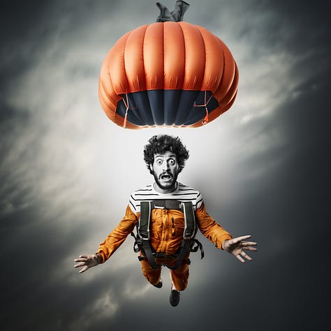
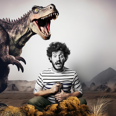
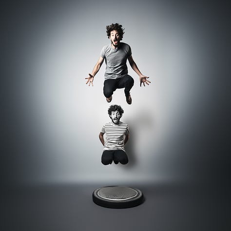
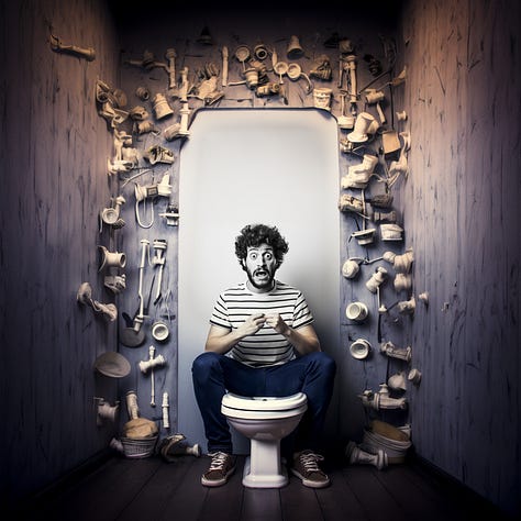
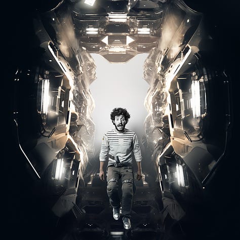
Notice how smoothly Midjourney blends the starting image with any new settings.
Over to you…
Have you already checked out Midjourney Version 5.2? What do you think of the “Zoom Out” feature and the new /shorten command?
I’d love to see examples of images generated by my readers, so don’t hesitate to share. Leave a comment on the site or shoot me an email (reply to this one).
My posts about previous Midjourney versions:
Midjourney Version 5.1: Back to Basics
When Midjourney Version 5 first came out in mid-March, the team was clear that it was a raw version without any “secret sauce” sprinkled in. They called it “unopinionated.” Well, Version 5.1. is here, and can you bet it’s got a few opinions! Here’s the official launch summary from Midjourney CEO David Holz:
Midjourney V5 Is Finally Here! How Does It Stack Up?
Two months later than expected, but Midjourney V5 has officially landed. The raw, alpha version 5 was released to everyone on Discord yesterday, which means you—yes, you—can test it out for yourself right now! But what’s changed in this version and how does it compare to what came befor…
How to Remix Images With Midjourney V4: Step-By-Step Guide
It happened at last. The siren call of Midjourney finally grew too seductive to resist. So I caved and returned to exploring it. Most of my articles so far have revolved around the Stable Diffusion AI. But Midjourney recently released an upgraded version of their algorithm








It's amazing to me that I spent a semester in the late 90s learning how to use marching ants, fill, select, magic wands, and... at the end of that time, I was able to create mind-blowing magic that looked as good as any professional's work in just a few hours' time.
Now, instead of a semester of learning (followed by years of practice), you can learn how to do prompt engineering in a day or two, then create stuff that would have been possible with Photoshop, but which would have taken you a month to do, in seconds.
Seconds!